

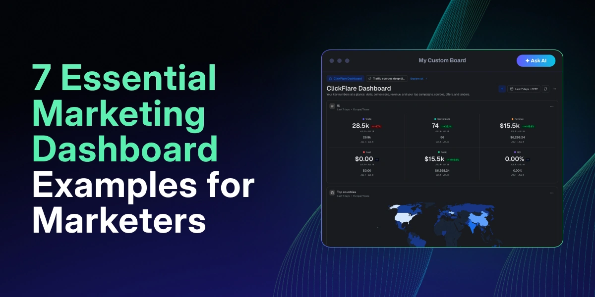

If you’ve ever scrolled through five different tabs trying to figure out which ad platform is actually making you money, you already know why marketing dashboard examples are worth “stealing” from. A good dashboard doesn’t just look clean, it answers a specific question the moment you open it, instead of making you dig for it.
In this article, we will share 7 marketing dashboard examples you can easily build on ClickFlare with the new custom dashboards feature, either manually or through the built-in AI copilot.
Quick Summary
Performance marketers, affiliates, and media buyers aren’t asking generic questions like whether brand awareness is trending up. They’re asking which ad network is bleeding budget, which offer is winning a split test right now, and which campaign deserves more ad spend today. That’s a narrower, sharper set of questions than most dashboards, built for a different job entirely, are set up to answer.
Most ad tracking software these days cover the basics with their generic dashboards: overall cost, revenue, and ROI across your campaigns, top offers, campaigns, and landers at a glance. That’s become “bare minimum” for a tracker built for performance marketing, not a differentiator on its own.
What actually sets ClickFlare’s new dashboard feature apart is the ability to go past that single default view. Instead of one dashboard trying to answer every question you might have, you can build multiple dedicated boards, each one a focused deep dive into a specific part of your performance, and use that focus to optimize further than a general overview ever could. The marketing dashboard examples below are built around exactly that idea.
Here’s a quick overview before we break each one down individually.
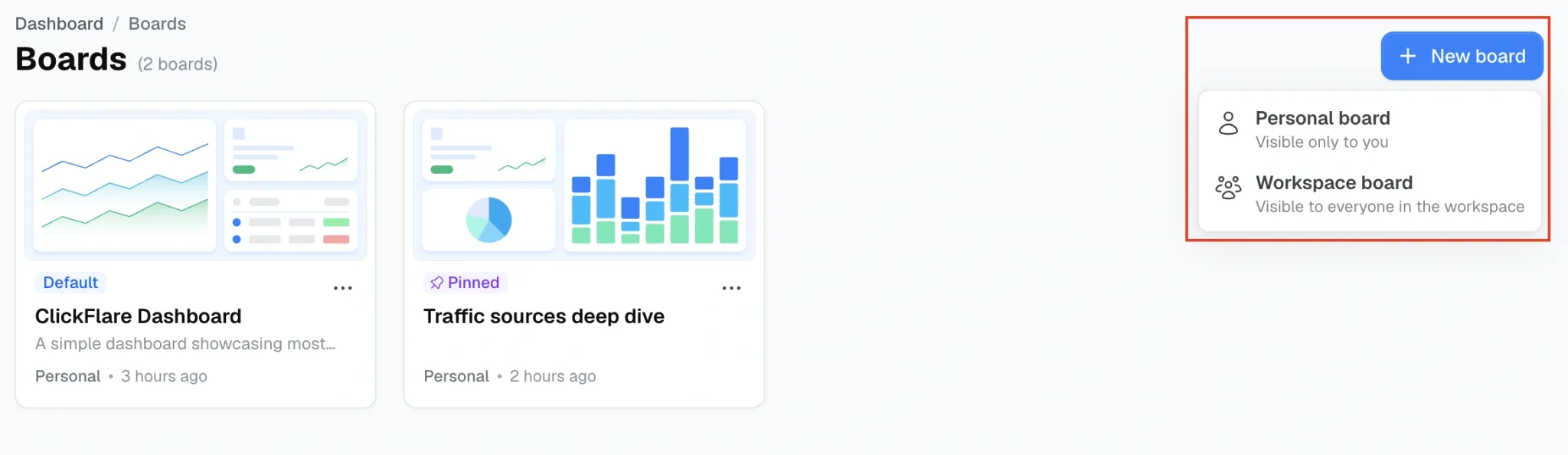
Under Boards, you can click on the top-right option New Board and choose to create either a personal board (only visible to you) or a workspace board (visible by everyone in your selected workspace).
Each board is made up of widgets. Widgets are simply graphs, tables, or text that appear on your dashboard. After creating a board, you can add widgets either manually, or by asking the ClickFlare AI copilot. Neither option requires any code. See our full guide on how to navigate the various dashboard options.
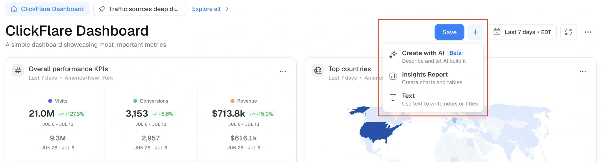
Once your widgets are built the way you like them, save the layout as its own board so each of these marketing dashboard examples lives in its own dedicated view.
When you log in for the first time, you will see two dashboards: the default dashboard (with a quick snapshot of your top KPIs, campaigns, offers, etc) and a custom dashboard called Traffic Sources Deep Dive.
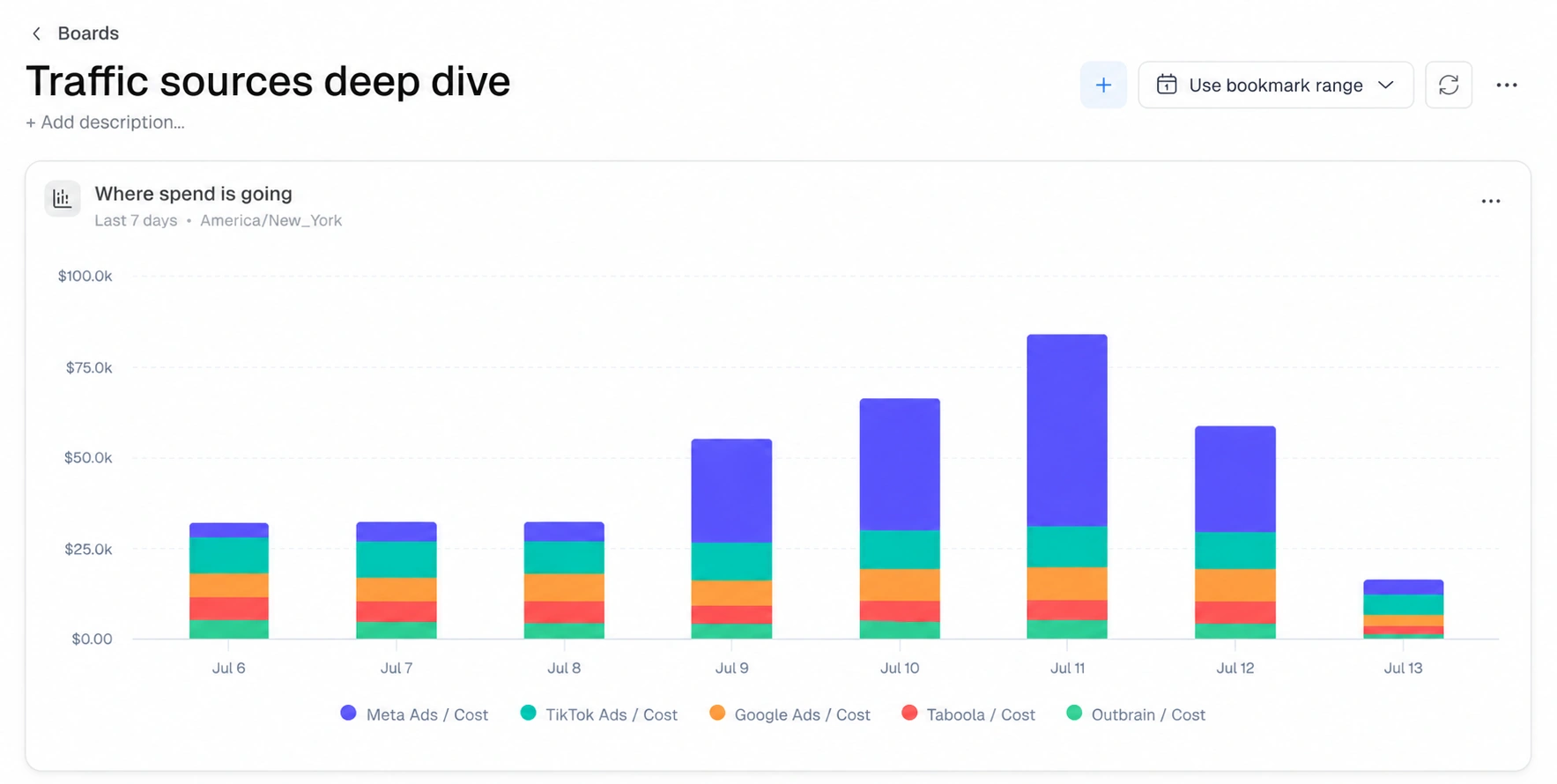
As mentioned before, this one is sitting in your Boards list the moment you log in. Rather than one graph or one table, it’s a full board with three connected widgets, all focused on comparing your ad networks against each other.
First, you have a stacked bar chart showing where your daily spend is going by traffic source. This gives you a quick idea of which platform is using up most of your ad budget.
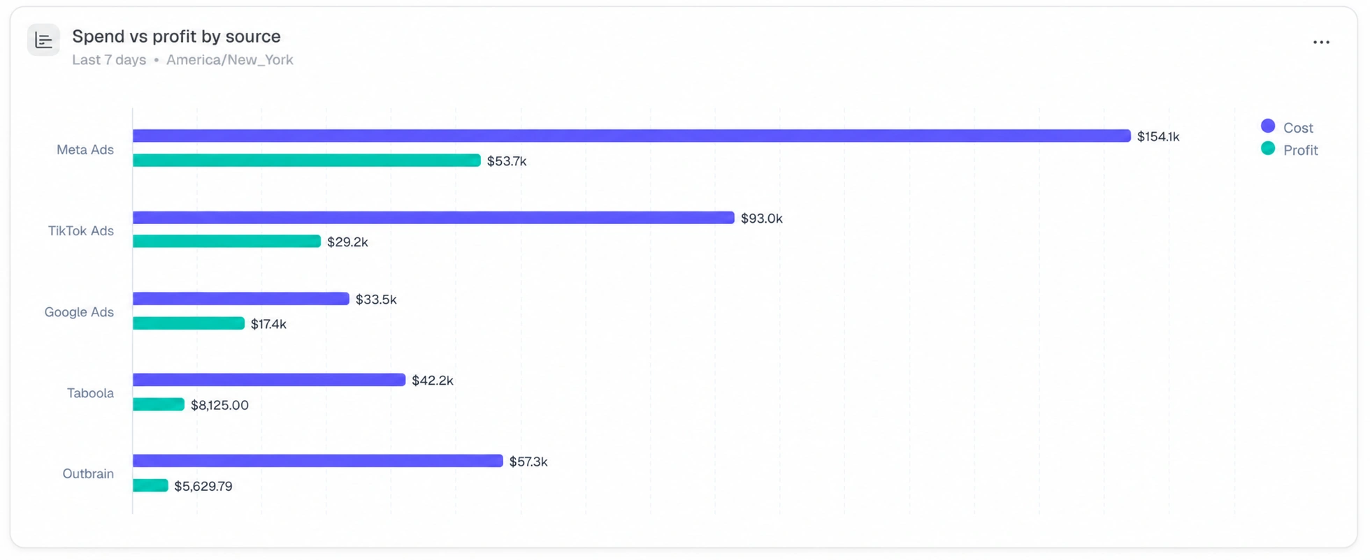
Next, a bar chart comparing cost against profit for each ad platform. You can easily spot which platforms are more profitable.
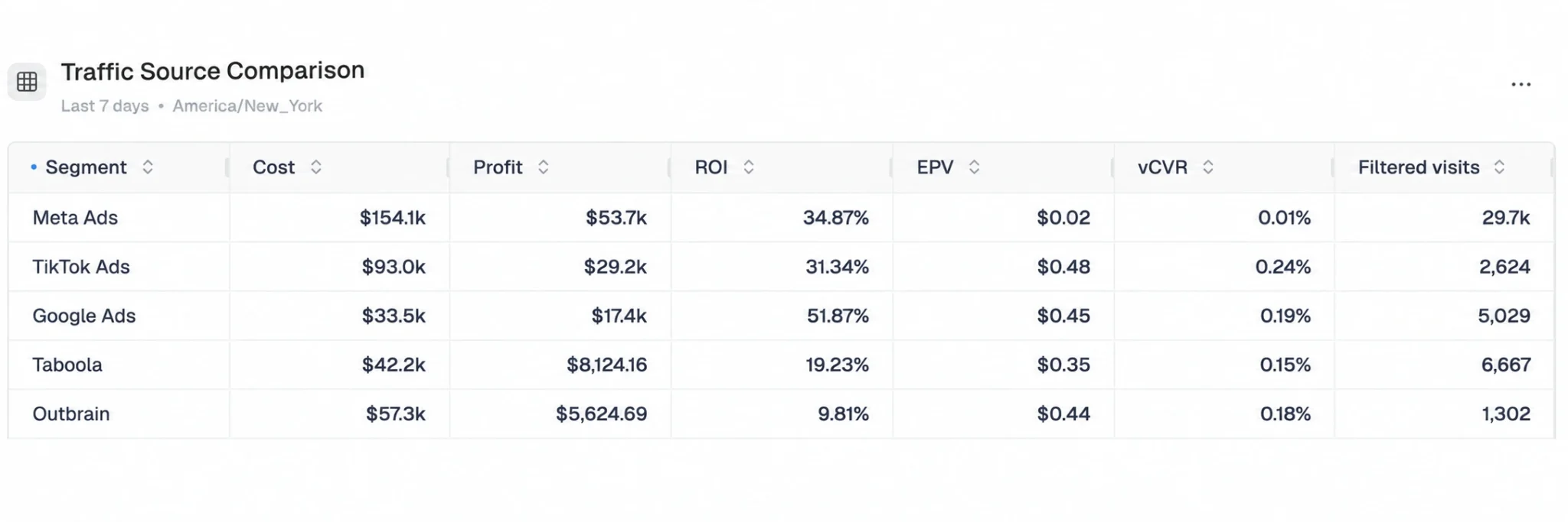
Finally, there’s a comparison table breaking out Cost, Profit, ROI, EPV, and other per-source metrics side by side. With this table you can look deeper into the data, past simple cost and revenue numbers.
If you’re running traffic across more than one network, this is usually the first board worth checking. It’s also a useful reference for the logic behind the boards below, since each one follows the same idea: a handful of connected widgets built around one specific question, instead of one board trying to answer everything.
The default dashboard’s Top Offers and Top Landers tables are useful for a general overview, but they’re sorted automatically and show your top 5 by traffic, not necessarily the specific variants you’re actively testing.
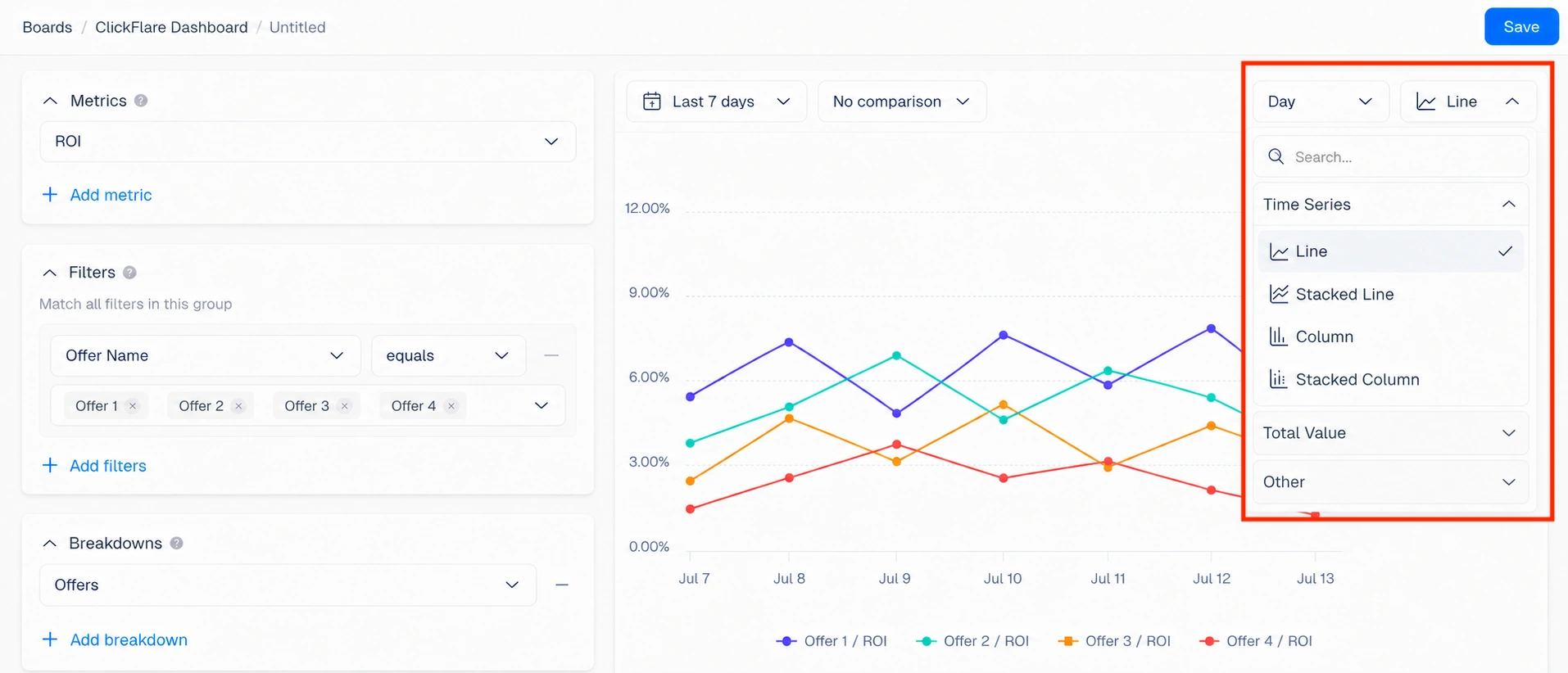
Build a dedicated board instead, with four widgets: a line chart plotting ROI by offer, filtered to just the offers currently in your test, and a second line chart doing the same for landers, so you can watch how each variant trends over the test period instead of judging it off a single snapshot.
If you are using the AI copilot, you simply need to paste the above explanation as a prompt and add the names of the offers/landers you wish to include. If you are building it manually, you need to select the correct metric (ROI), filters (the actual offers/landers you want to include), and breakdowns (Offers in this example). You also need to choose the type of graph (for example line graph, bar, table, etc).
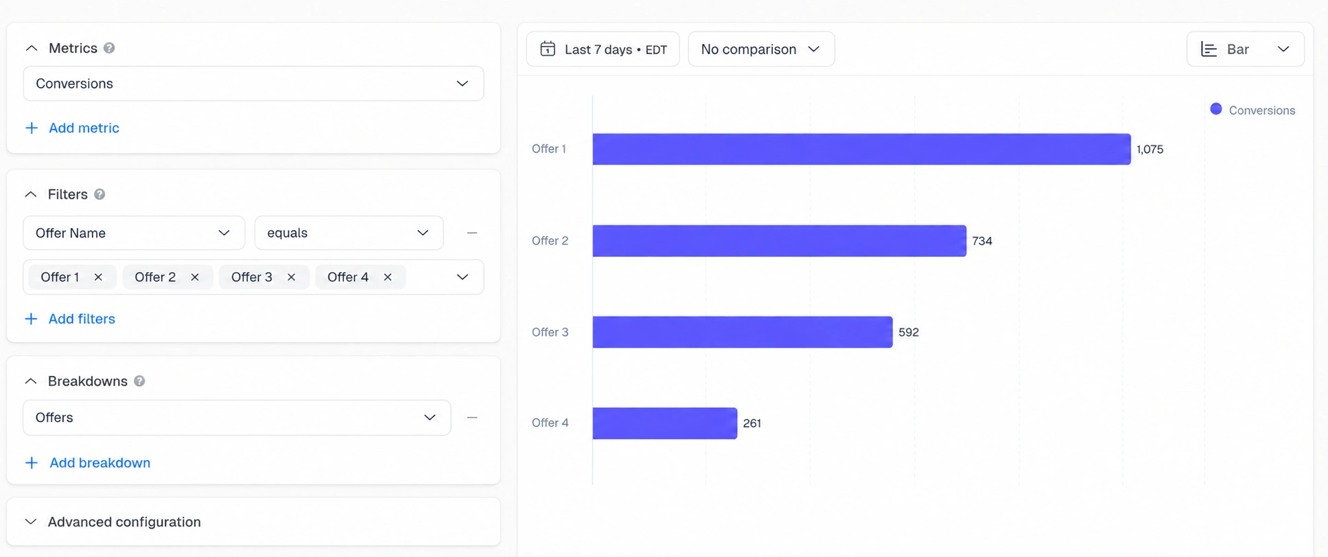
Add a bar chart comparing conversions across those same offers and landers, since a variant can look strong on ROI but still be running on too little volume to trust yet. We recommend creating a separate widget for offers and landers to keep your data clean.
Round it out with a comparison table breaking out Cost, Conversions, Revenue, ROI, and EPV for every variant side by side, the exact numbers a chart alone won’t show you cleanly.
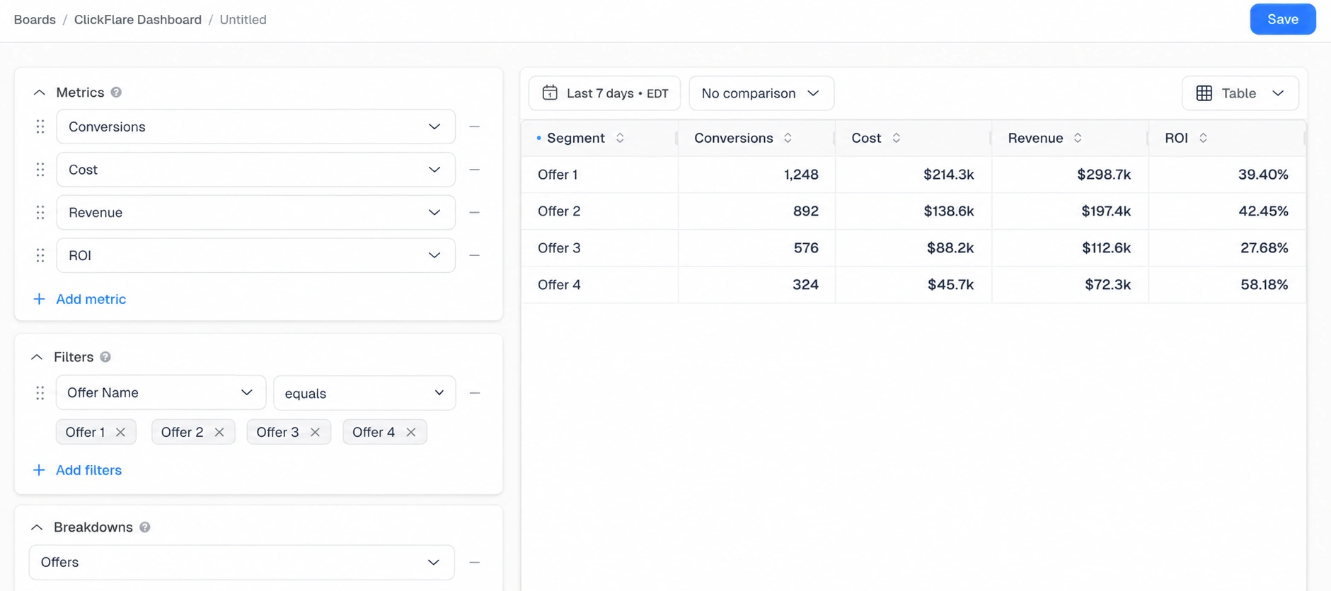
A common pattern this surfaces is a lander with a high click-through rate but a mediocre ROI, going up against a plainer lander that converts better. Without a filtered, side-by-side view, it’s easy to keep the flashier lander simply because it feels like it’s working. The same logic applies to offers: a payout bump on paper doesn’t always translate into a better ROI once cost per conversion is factored in, and this board is where that gap actually becomes visible.
The default dashboard’s Top Countries widget is a map showing where your visits come from, which is useful, but it’s visit volume, not profitability. Build a board that goes one layer deeper: ROI by country as a bar chart, profit by country as a trend line over time, and a comparison table with Cost, Revenue, Profit, and ROI broken down by country.
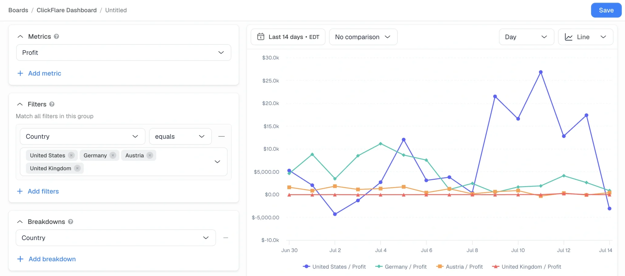
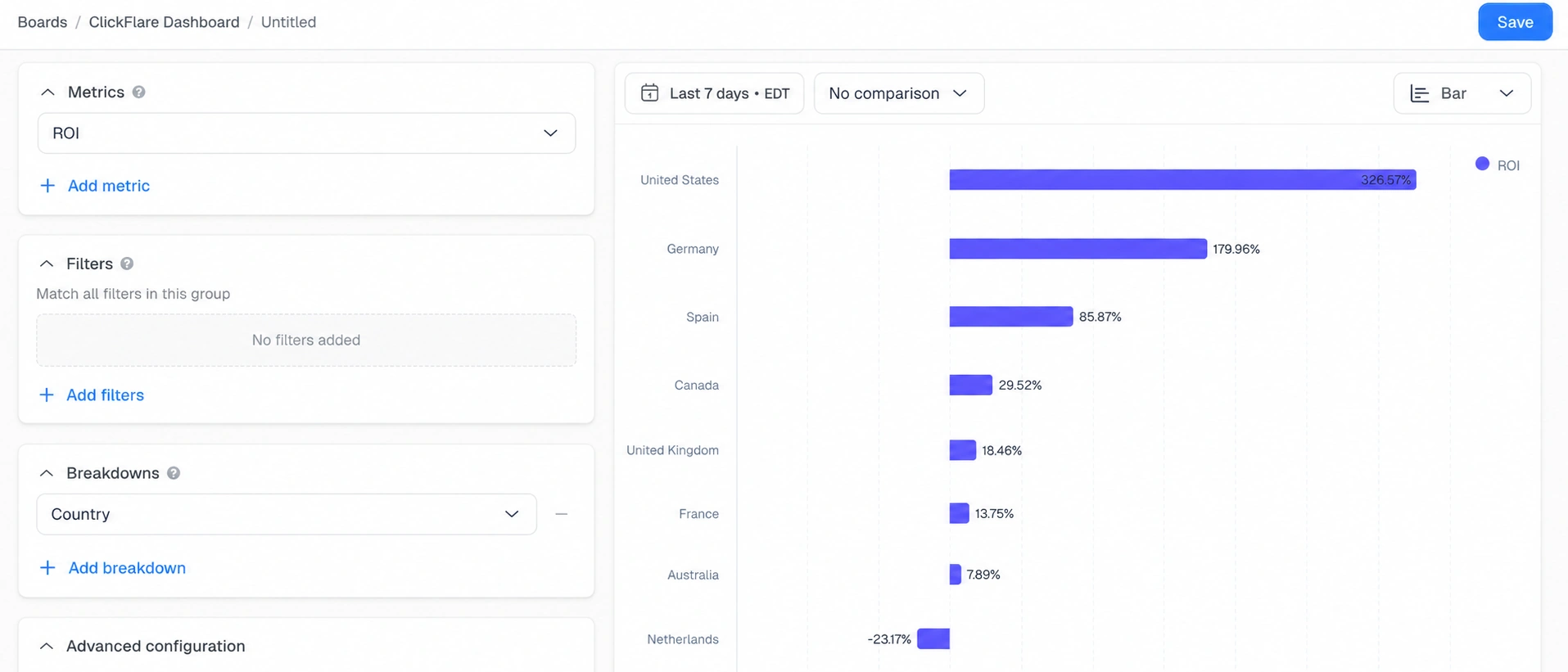
If two countries are sending similar traffic volume but very different ROI, that gap usually means the lander, payout, or offer needs to be localized rather than reused as-is across markets, something the visits-only map can’t tell you on its own.
The default Top Campaigns, Top Offers, and Top Traffic Source tables sort by traffic volume first, which means your most profitable campaign can get buried under a higher-traffic one that barely breaks even. Build a board that ranks campaigns by Profit instead of Visits, ranks offers by ROI, and a trend line tracking profit for your current top performers.
This board answers a different question than the default view: not “what’s getting the most traffic,” but “what deserves more budget right now,” which is usually the more useful question when you’re deciding where to scale. It’s especially useful once you’re managing enough campaigns that scrolling past low-profit, high-traffic entries every time is starting to slow you down.
Visits and conversions both show up on the default dashboard, but never side by side in a way built to spot drop-off. Build a board plotting Visits against Conversions by campaign on the same graph, a conversion-rate metric broken down by traffic source, and a table showing Visits, Conversions, and EPV by offer to see exactly where clicks stop turning into results.
This is especially useful when a campaign’s overall numbers look fine but something specific, a particular offer or traffic source, is quietly dragging the average down. Catching that at the segment level, instead of only at the campaign level, is usually what turns an okay campaign into a profitable one without needing any additional traffic.
The default KPIs by Hour graph is account-wide, which is exactly what you don’t want when a brand-new campaign just went live and you’re trying to watch it closely without other campaigns’ data drowning it out. Build a board filtered to just that one campaign: an hourly Visits and Conversions graph, a Cost-vs-Conversions trend line for the first few days, and a Text widget to log what changed and when.
Once the campaign is past its first week or two and behaving predictably, you can archive or repurpose this board rather than keeping it running indefinitely.
If you’re running an agency or managing campaigns as part of a team, you don’t always want your working boards visible to clients or teammates. Build a clean, simplified workspace board (visible to everyone in that workspace) with just the metrics a client actually needs to see, paired with a Text widget explaining the numbers in plain language, and keep your personal testing boards separate.
It’s a small distinction, but it saves you from explaining messy internal widgets during a client call, and it means anyone on the team sees the same numbers without needing access to your personal boards.
The best marketing dashboard examples aren’t the ones with the most widgets, they’re the ones built around a question your default dashboard doesn’t already answer. Traffic Source Deep Dive is ready to use today. For the rest, start with whichever question you’re actually stuck on right now, whether that’s a split test, a GEO expansion decision, or figuring out what to scale next, and build one focused board around it instead of adding more widgets to an already-busy default view.
If you are not sure how to create the board you are aiming for, use the Create with AI function and explain as clearly and detailed as possible what you are trying to achieve.
No. It’s a pre-built board ClickFlare already created, and it appears in your Boards list automatically once the new dashboard feature is live on your account. You can duplicate its structure for your own themed boards, but it doesn’t need to be built from scratch.
No. Every board in this article can be built without writing any code, either by describing the widget you want to ClickFlare’s AI copilot or by selecting metrics, filters, and breakdowns manually through the Insights Report builder.
A personal board is visible only to you, while a workspace board is visible to everyone in that workspace. Agencies and teams typically use workspace boards for shared or client-facing reporting, and personal boards for their own testing and analysis.
Yes. When building a widget manually through Insights Report, you can add multiple metrics to a single chart or table instead of creating a separate widget for every KPI you want to track.
Yes. Custom dashboard widgets and boards are live on all ClickFlare plans, so there’s no upgrade required to start building any of the boards covered in this article.
Check Traffic Source Deep Dive first since it’s already there. After that, build whichever new board answers the question you’re currently stuck on, the Scaling Candidates board if you’re deciding where to increase budget, or the Split-Testing board if you have an active test running.
Yes. While the board itself is pre-built, its structure, a few connected widgets filtered around one specific question, is a reusable pattern. Every custom board in this article follows that same approach, just applied to a different metric or segment.